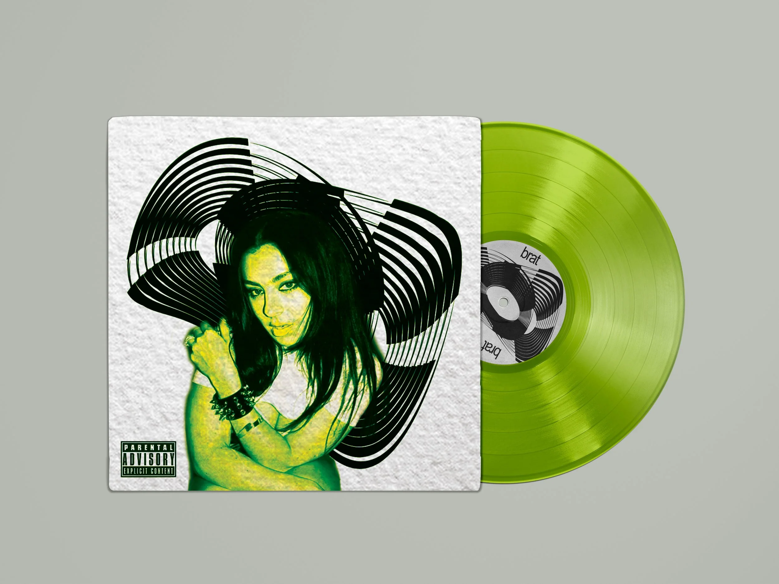
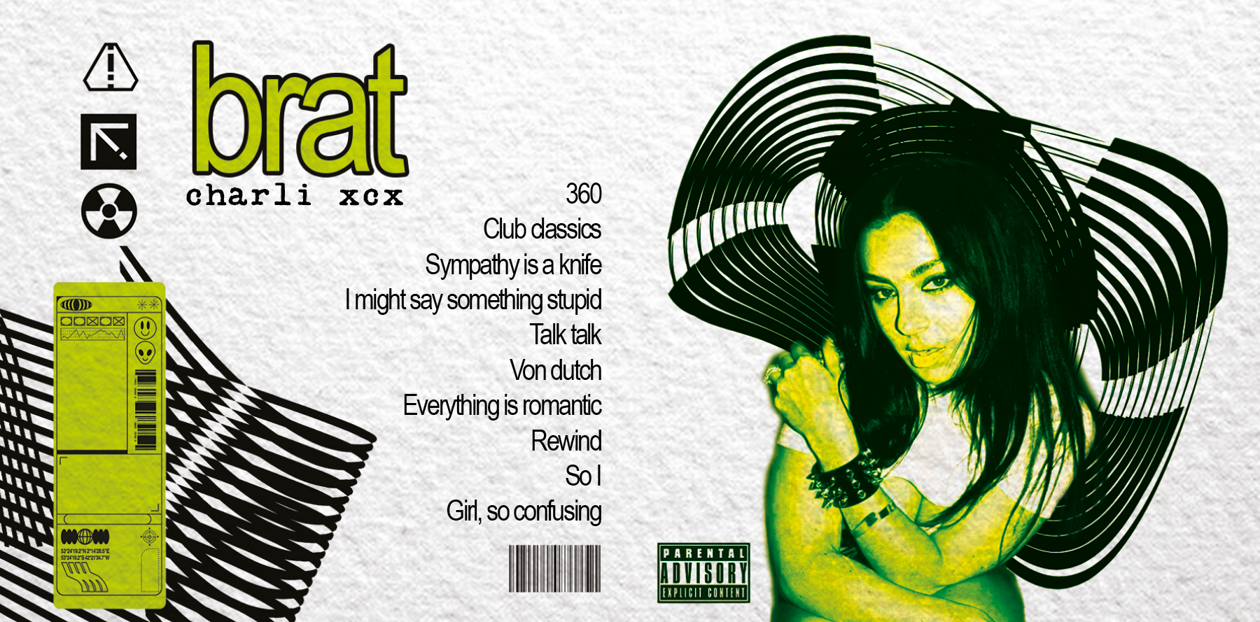
“Brat” Album cover for Charli XCX
In this work I analyzed the target audience and direction that this singer is moving. I had a vision for this project and after research I made the whole editing in PhotoShop.

Examination of
Past Covers
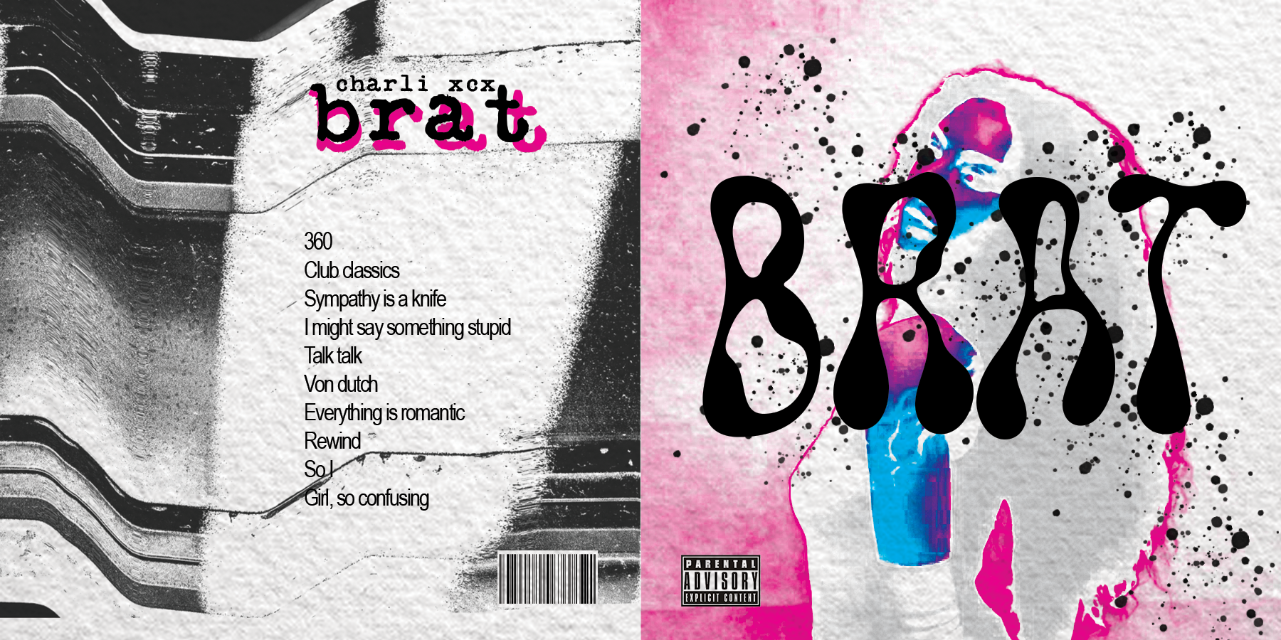
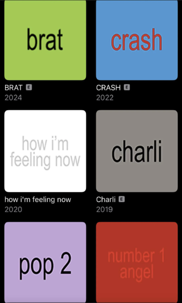
I’ve noticed that Charli XCX’s album covers haven’t changed much over the years. They’ve always been full of neon colors and raw energy, Albums like Pop 2 and Charli took on a more polished but still futuristic look.
Her visuals leaned into cyber aesthetics, glitchy edits, and avant-garde styling. Now, with Brat, her whole aesthetic has shifted to a bold neon green and black color scheme, minimalist but striking typography, and an overall industrial, bratty, and rebellious vibe.
Target Audience
Charli’s fanbase is mostly Gen Z and Millennials, especially those into alternative pop and hyperpop. A lot of her fans are part of internet subcultures that love digital aesthetics, club culture, and avant-garde fashion. The LGBTQ+ community plays a big role in her audience, since her experimental and boundary-pushing sound resonates deeply with them. These fans are drawn to bold color palettes, digital nostalgia, and hyper-stylized design elements.
They love things that feel raw, high-energy, and a little chaotic, but still put together in a cool and intentional way